Membership Hub Case Study
Overview
The Membership Hub project was a complete redesign of the account area across all platforms, aimed at improving usability, navigation, and business alignment while creating a scalable and flexible structure for future enhancements. By applying a structured design thinking approach, we ensured that the solution was deeply rooted in user needs and industry best practices.
Understanding the Problem
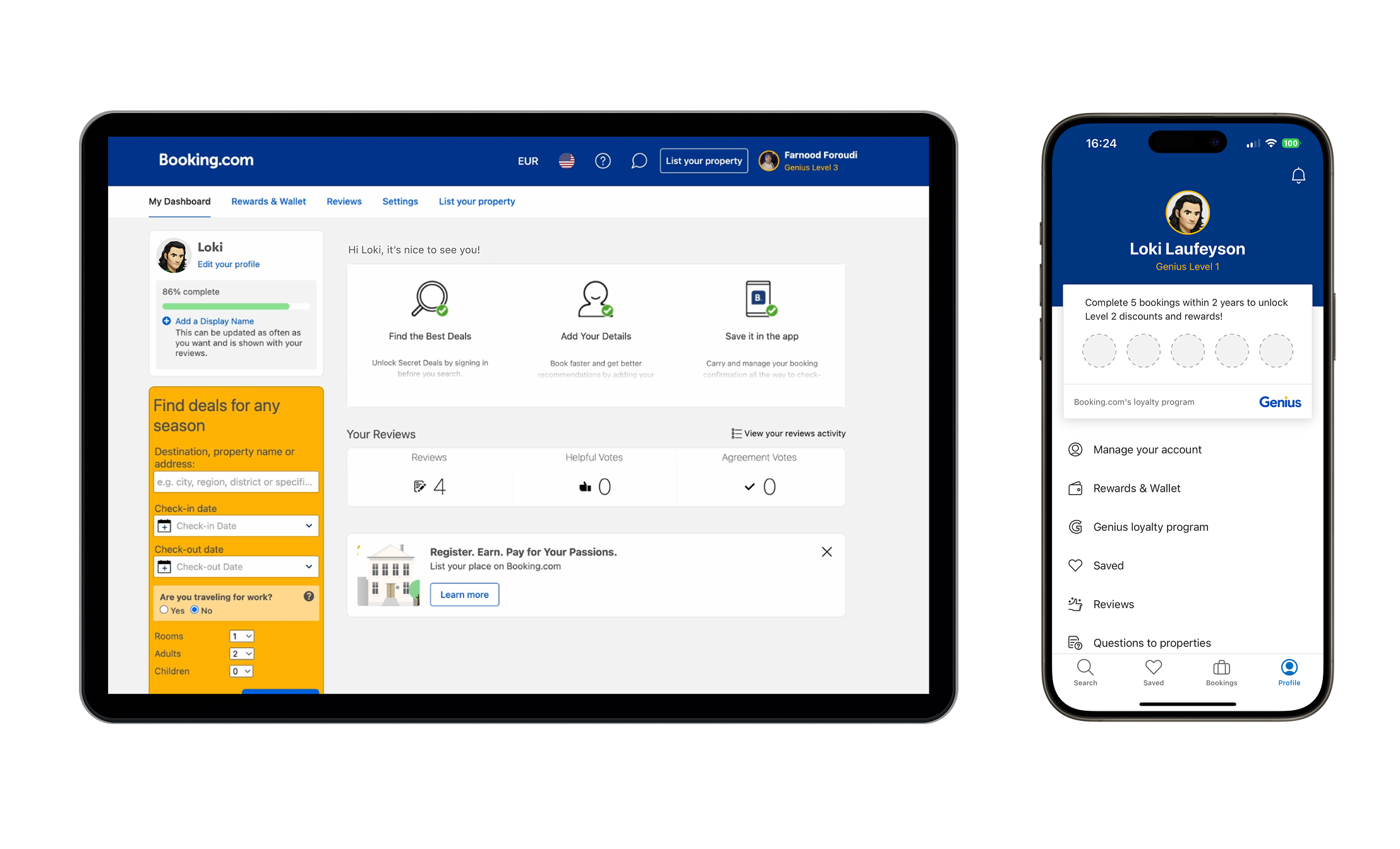
The project began with a discovery phase to understand the existing experience, identify usability gaps, and gather business requirements. The current account area was cluttered, inconsistent across platforms, and lacked clear information hierarchy, leading to high drop-off rates and frequent user frustration.
To gain a comprehensive understanding, I conducted an internal audit of the existing account area, mapping out all available functionalities and their accessibility. At the same time, my PM and I interviewed key stakeholders—including customer support, loyalty teams, and marketing—to uncover business priorities and pain points. This helped us identify a misalignment between user needs and business expectations, reinforcing the necessity of a well-structured and user-friendly Membership Hub.
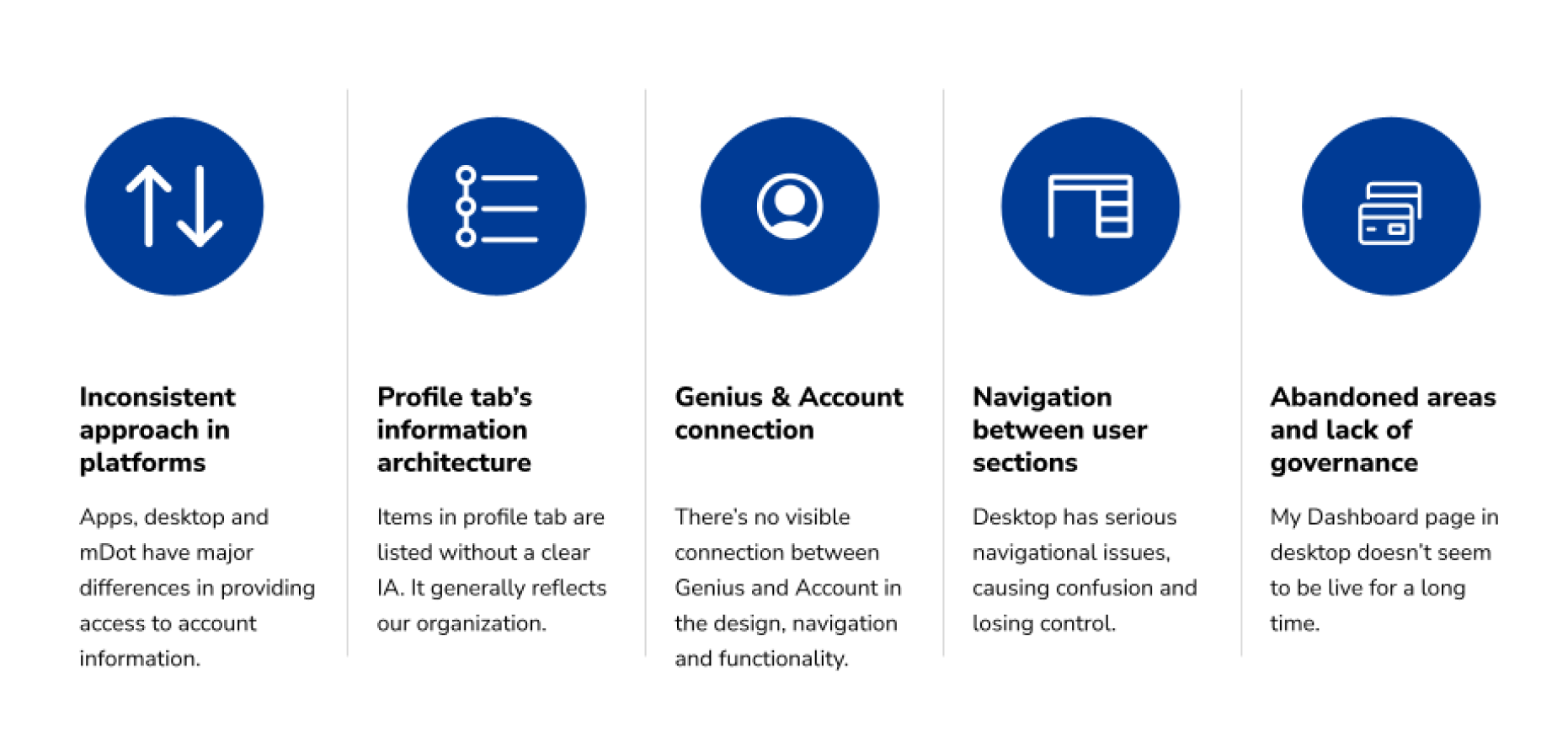
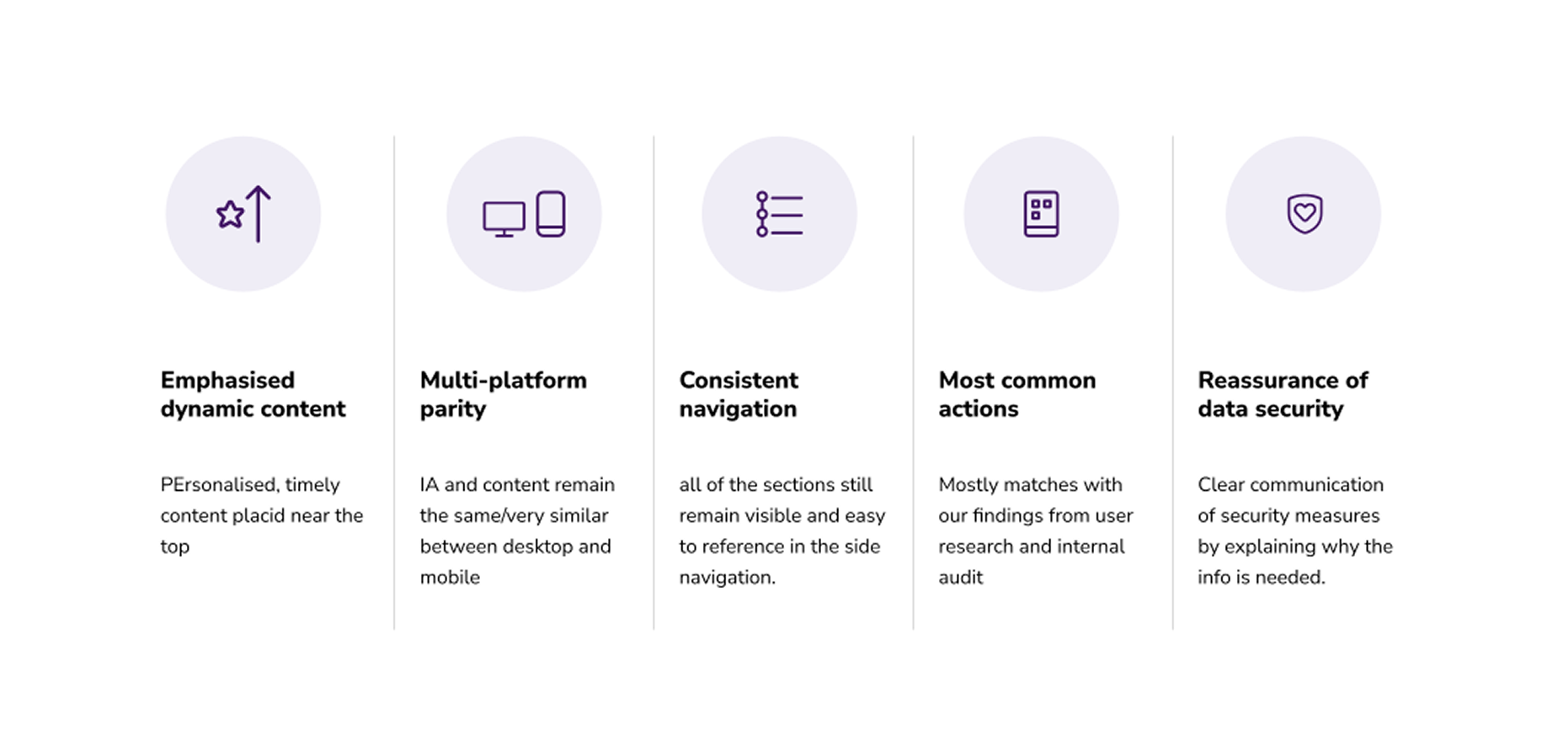
To put structure around user needs, we documented Jobs-To-Be-Done (JTBDs), listing essential tasks users expected to accomplish in their account area. We also conducted an industry audit, benchmarking against competitors to explore best practices. Through this process, I identified two dominant UX patterns across the industry: content-heavy dashboards that surface important information directly and navigation-focused structures that act as an entry point to deeper account sections.
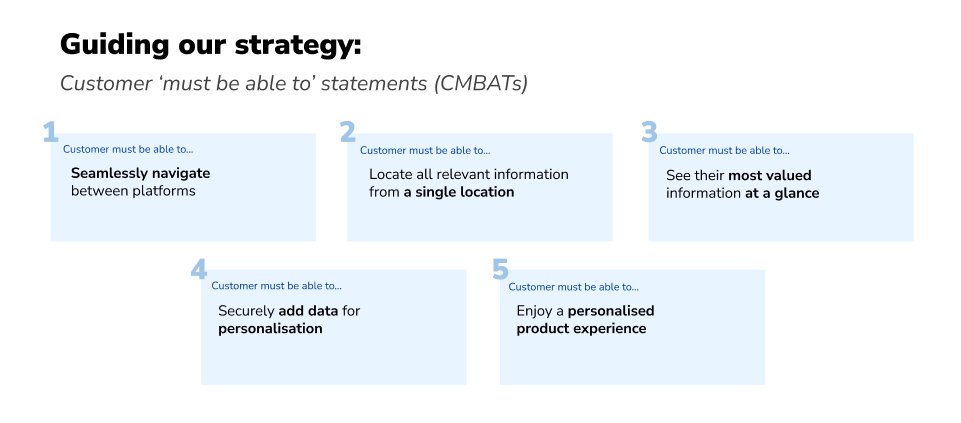
To validate our understanding, we conducted a card sorting study, where users grouped account-related tasks based on their mental models. This helped us define clear hierarchies and user expectations for the Membership Hub, revealing which elements should be prioritized. From these insights, I developed Customer Must Be Able To (CMBAT) statements, which became our guiding principles throughout the design process.
Exploring the Solution
Armed with research insights, we moved into ideation. I kicked off the design exploration phase by facilitating a two-day design sprint with stakeholders from UX, Product, and Engineering. The goal was to bridge user needs with business objectives while ensuring feasibility. During the sprint, participants wrote user stories based on our JTBD statements, which helped frame the problem from the travelers' perspective.
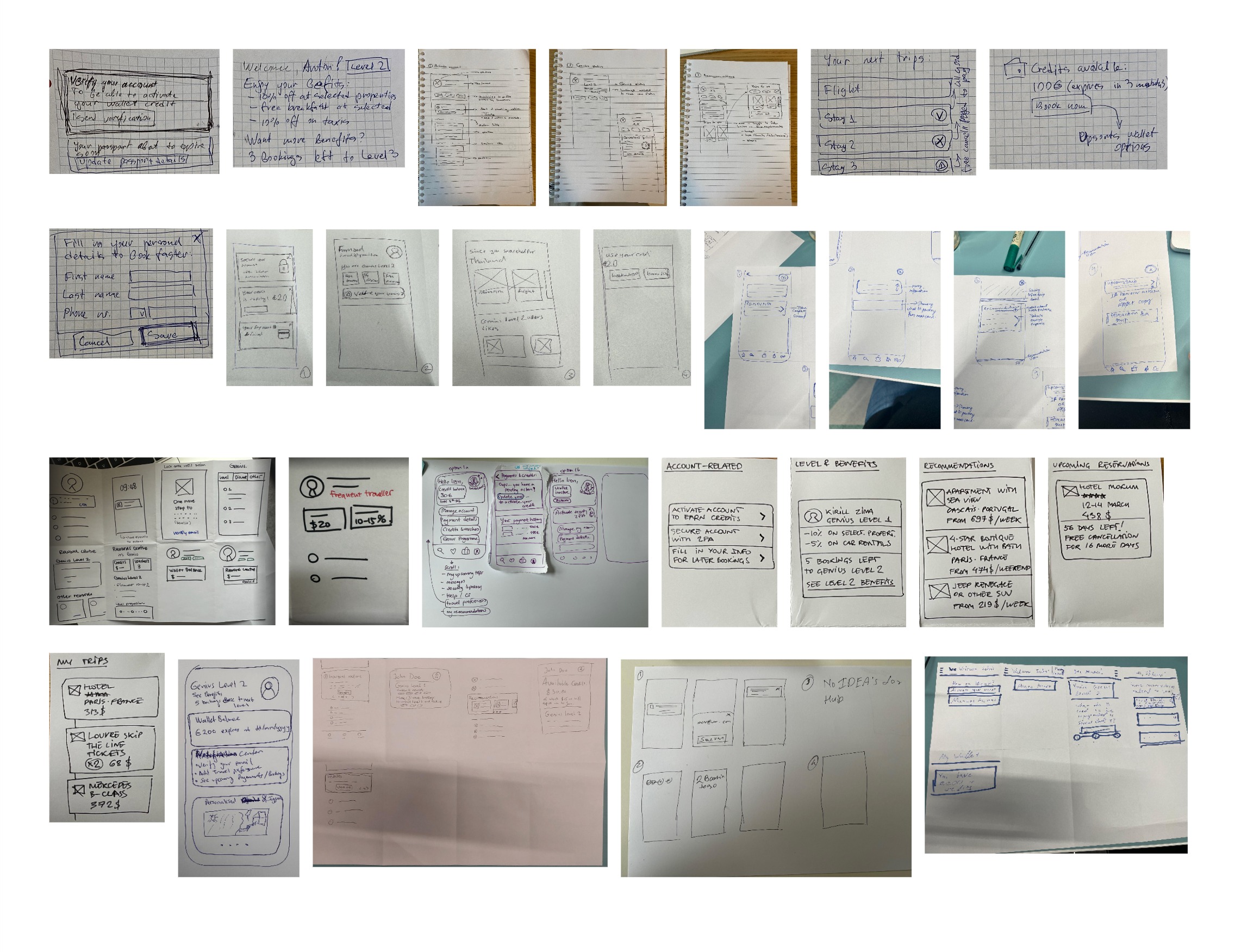
These were followed by rapid sketching sessions, resulting in two core design directions:
- A navigation-focused solution, emphasizing easy access to key account functionalities with minimal distractions.
- A content-heavy dashboard, surfacing rewards, promotions, and critical actions upfront.
To refine these ideas, I collaborated with our UX writer to define a content strategy and high-level information architecture. We categorized content into two main groups:
- Dynamic content, such as rewards, wallet balance, and loyalty status.
- Static content, including account settings, privacy, legal information, and preferences.
However, as we continued discussions with business stakeholders, it became evident that multiple teams needed visibility within the Membership Hub. This introduced a challenge—how could we balance business visibility with user priorities without overwhelming the experience?
To solve this, I organized a UX workshop with 13 designers from various teams, including Fintech, Genius, Marketing, and Identity. Each team was asked to prioritize their content needs and design modular widgets in three different sizes (small, medium, and large), inspired by iOS widgets. This ensured that stakeholder needs were represented in a structured way while maintaining consistency with our design system.
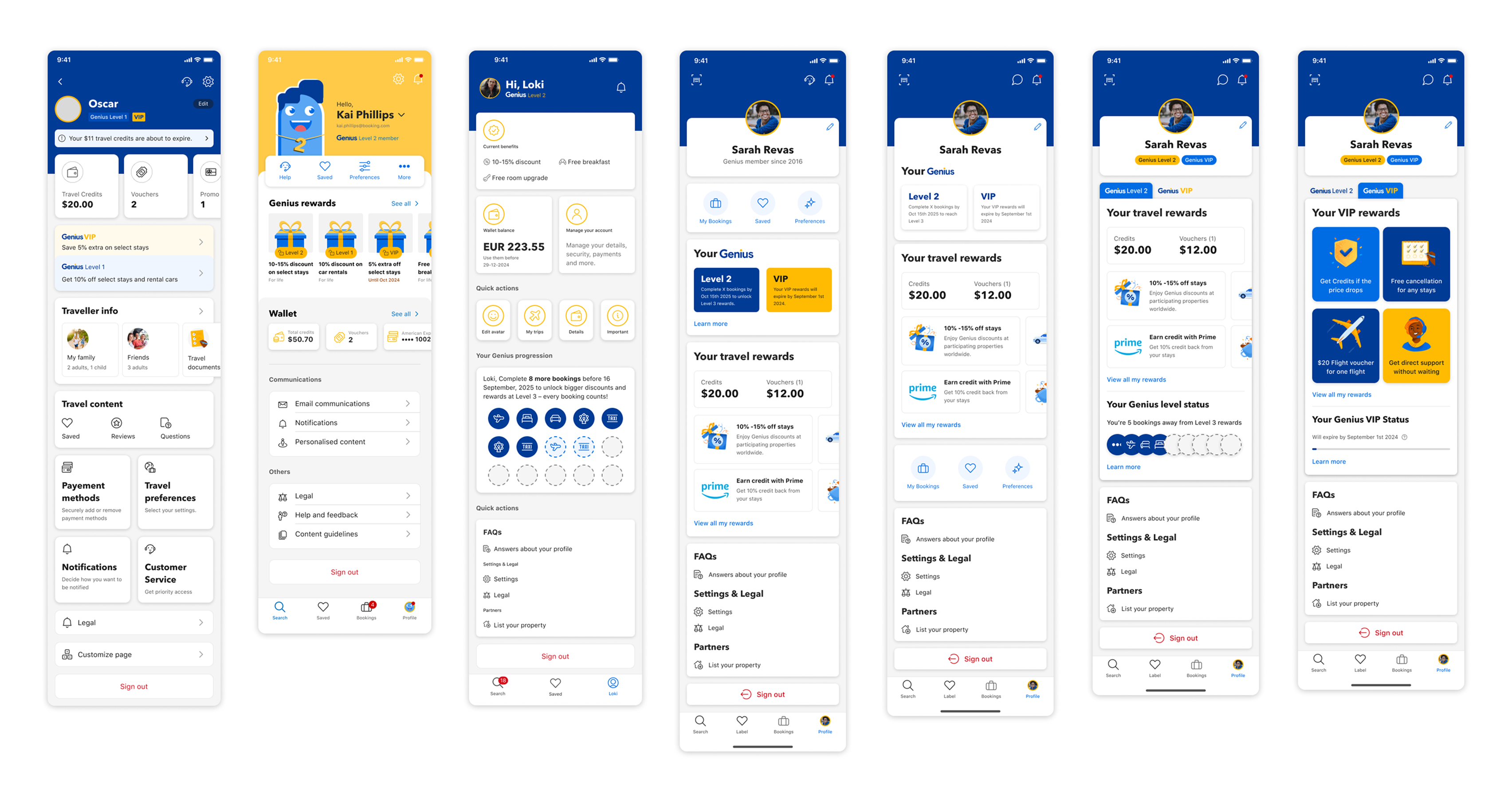
Taking the modular widgets created during the workshop, I developed two distinct prototypes to explore different approaches:
- Navigation-Focused Prototype: This version prioritized quick access based on user mental models revealed in our card sorting study. It featured a clean, organized navigation structure with minimal content upfront, allowing users to efficiently access their desired account sections.
- Dashboard-Style Prototype: This alternative took a content-rich approach, strategically incorporating the business teams' widgets to surface key information, rewards, and promotions directly on the main view. The widgets were carefully arranged to maintain visual hierarchy while meeting stakeholder visibility needs.
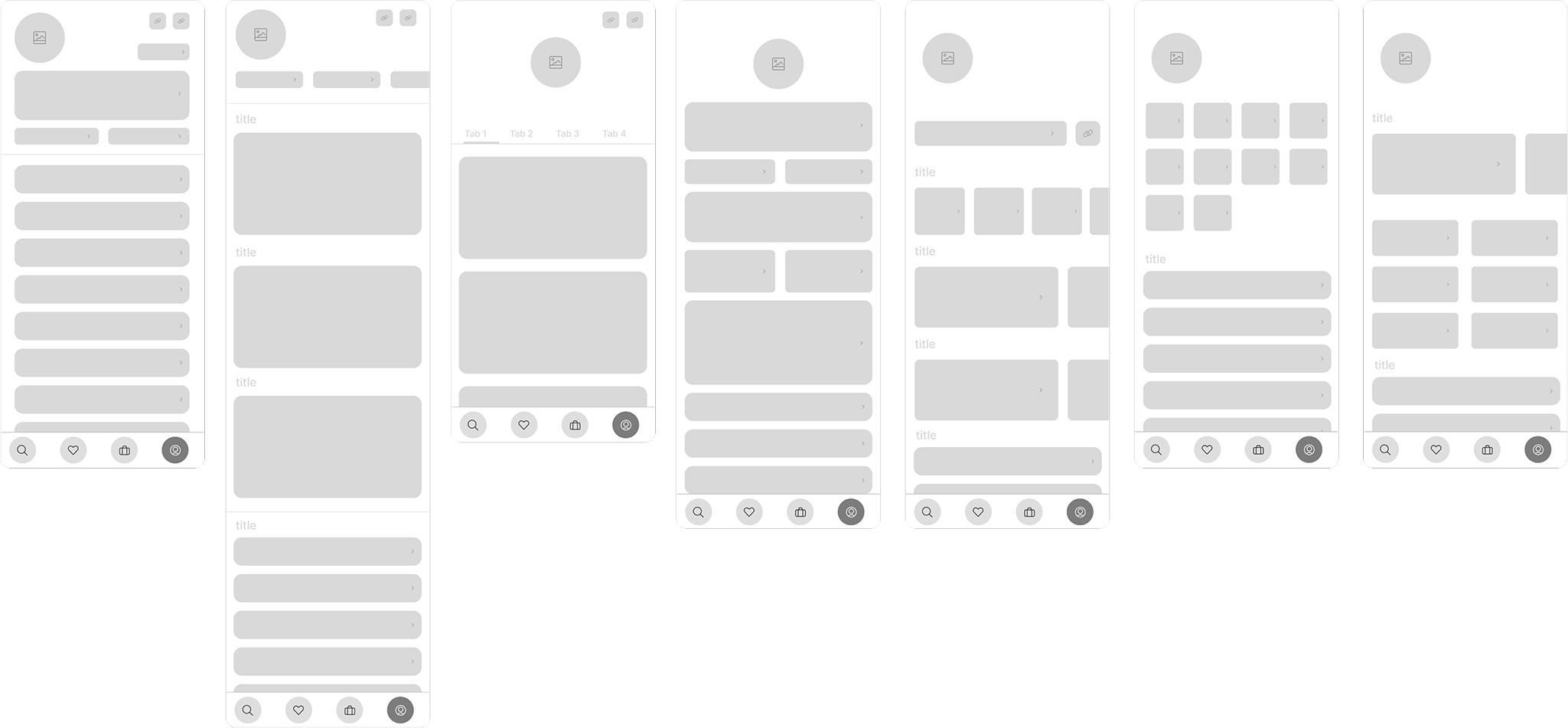
Both prototypes maintained our core UX principles but offered different solutions to the challenge of balancing user needs with business requirements. The navigation-focused version emphasized efficiency, while the dashboard approach prioritized discovery and engagement with membership benefits.
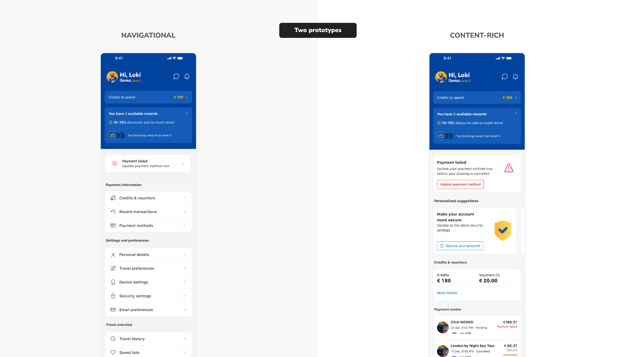
Materializing the Design
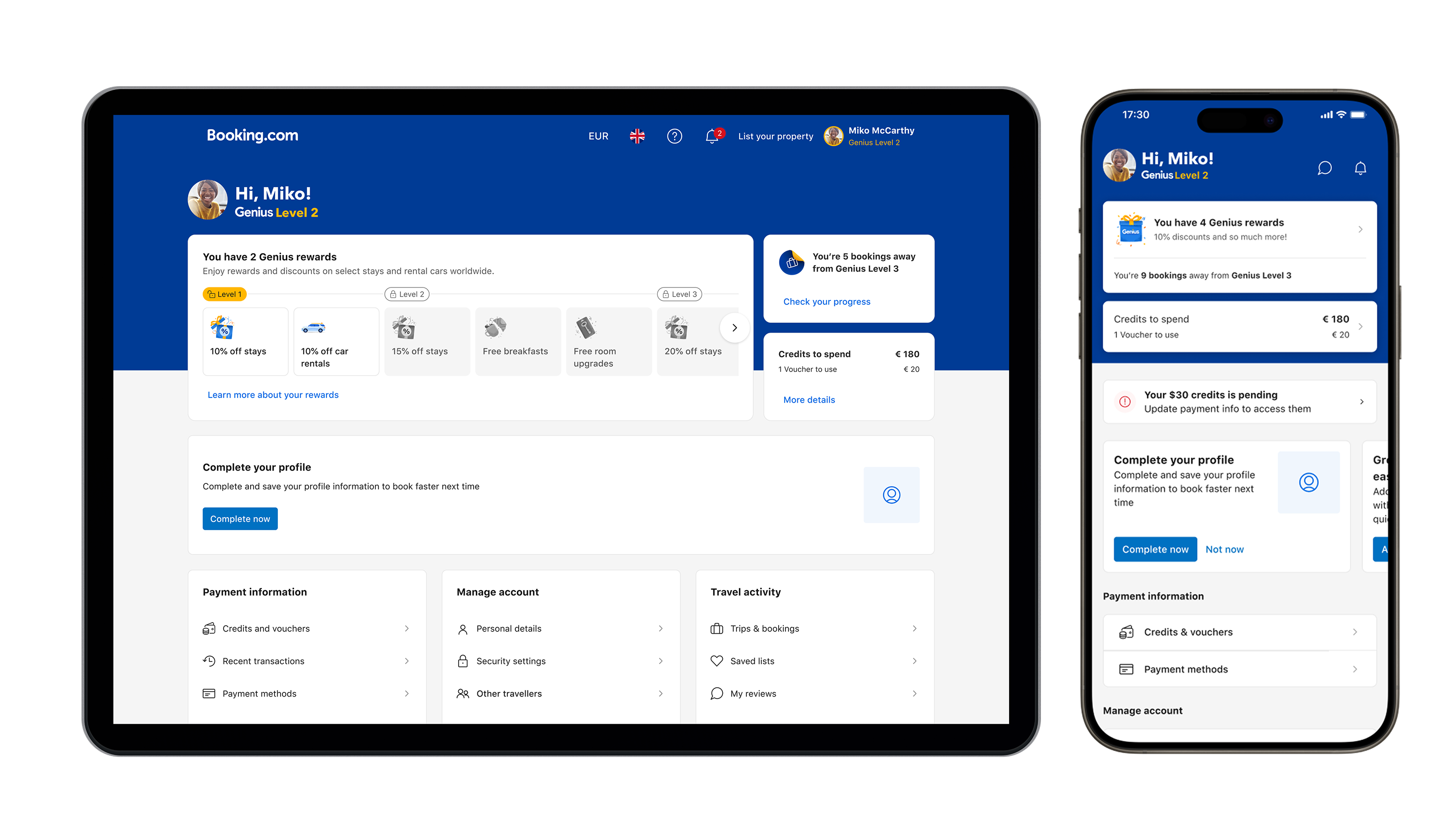
With the direction finalized, I focused on bringing the design to life. The Membership Hub structure consisted of three core regions:
- Rewards & Benefits – A top section summarizing Genius status, available discounts, and spendable credits.
- Suggestions & Recommendations – A critical actions message bar and a carousel of banners for important updates.
- Account Navigation – The largest section, offering quick access to account settings, support, preferences, and payment methods.
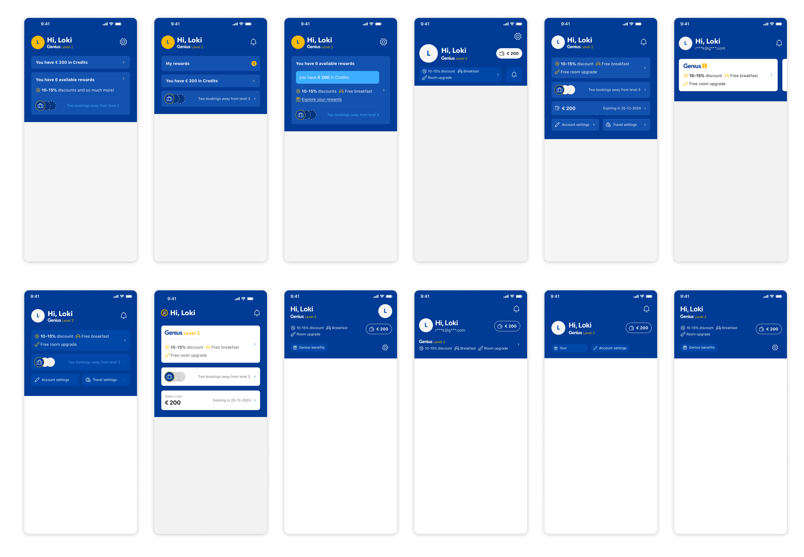
To ensure consistency across platforms, I collaborated with platform designers and engineers, refining the UI for both mobile and desktop. Since desktop had more real estate, we took advantage of larger visual elements for rewards representation.
I also worked closely with our accessibility team, ensuring the Membership Hub met WCAG standards. Using Fable, we tested screen-reader compatibility, making adjustments to improve navigation and interaction for visually impaired users.
Experimentation & Rollout
Before launching, we ran an A/B experiment, exposing 80% of users (excluding a holdout group) to the new experience. The results showed:
- ✅ Higher engagement with loyalty, rewards, and wallet sections.
- ✅ More intentional customer support visits (lower drop-offs from the support page).
- ✅ Increased account completion rates.
- ✅ A positive impact on our core metric: Predicted Net Customers (PNC).
With these strong results, we proceeded with a full rollout.
Iterations & Next Steps
Post-launch, we continued refining the experience based on user behavior. One key test involved introducing a more visual rewards display for mobile users, similar to the desktop approach. However, data showed that mobile users preferred a more concise view, leading us to revert to a streamlined layout.
Next, we plan to:
- Enhance the hierarchy of rewards for better clarity.
- Develop a Benefits Center within the hub.
- Iterate on Global and Local navigation for better scalability.
Conclusion
The Membership Hub successfully redefined how travelers interact with their account, balancing usability with business needs while maintaining a scalable structure for future improvements. Through extensive research, iterative design, and data-driven validation, we delivered an intuitive, user-focused solution that will continue evolving to meet user and business goals.